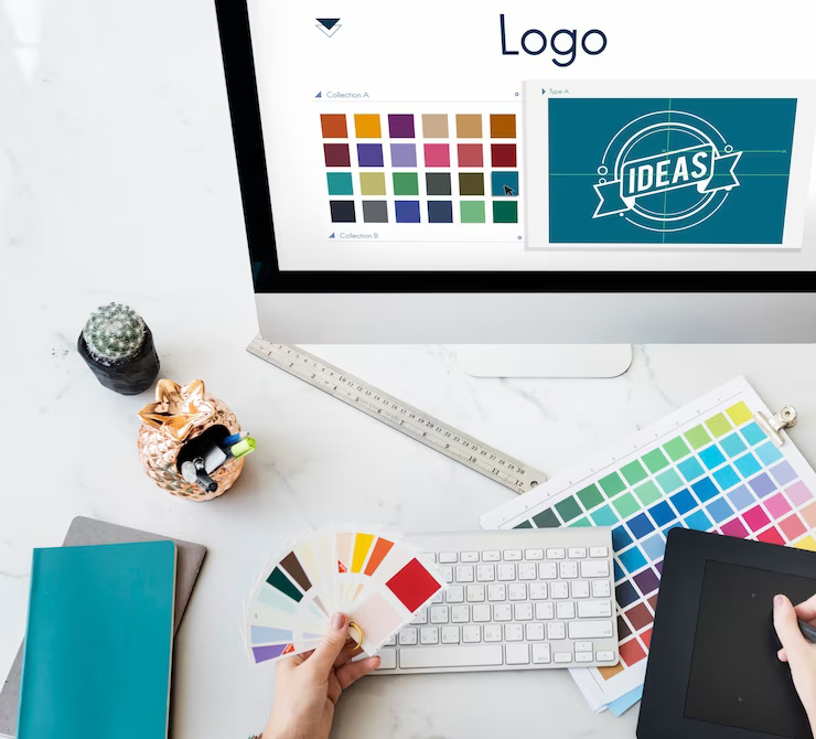
Logo Designing
20 Dec 2023
Types Of Logos
When we see an amazing “logo” the first thing we think about is the brand associated with it. Logos create the visual identity of a brand. A fine mix of colors and a cool design differentiates a brand and creates its own unique identity in the market. It is usually a text, word, an image that might be graphical (vector or sometimes raster), or a blend of both which symbolizes a particular product, or the company associated with it. It is an emblem that helps you identify a product among many other products from different brands. A visual symbol such as a brand logo is easy to identify and hard to forget once seen, these act as the face of a company. An attractive logo highly influences the consumer to purchase products from the brand as it looks promising and gives a hint about the quality as well as brand values. Brand emblems or logos come in different shapes, sizes, colors, and designs and there are different types of the latter as well. We are best logo designing company in New York, in this blog post, we are going to learn about the various types of logos and how they are used in companies that have earned a great reputation in the market.
Different Types Of Logos
Logos come in many different variations, and we are going to learn about their types as well as their uses in creating the identity of a brand. All types of logos have their own characteristics, that communicate the brand values and create a unique identity for the brand. It should be designed in such a manner that it can serve the company as well as its target audience. These are the different types of logos.
Wordmarks Logos
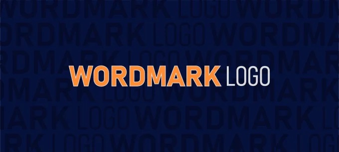
Wordmark logos also known as ‘logotype’ are the most classic form of logos. These consist of the names of the company in different creative fonts and colors. Wordmarks are name based. A few famous examples of wordmark logos are Google, Coca-Cola, Amazon, Subway, eBay, Kellogg’s, etc. All of these logos are brand names with their own distinct fonts and color patterns which display the identities of these brands. There is no other company that can use the fonts and color patterns of these brands to create a wordmark logo with a different name. The most important aspect of wordmarks is that the name of the brand should be catchy and not very long, like Google, and should be able to create a strong brand recognition. Whenever you look at the font, the first thing that should cross your mind is the name of the brand. That is the impact that these big organizations have created with their logos on the minds of the people. These are easily recognizable, and it is easy to know the name of the brand. Wordmarks usually consist of a four-letter word which is the initial of the company name or an abbreviation of the full name which may be lengthy (more than 2 words), these abbreviations are catchy and short for example, Google (Global Organization Of Oriented Group Language Of Earth).
Letter marks Logos
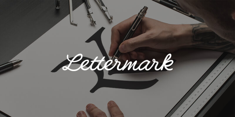
Letter marks are also known as ‘monograms. Unlike wordmarks which consist of a fully readable word, letter marks are just the first letters of a brand name. These logos are typography of a single letter of the company name or the abbreviation of 2 or more letters of the whole name (consisting of two words). Monograms usually consist of the initials letter of the brand name in a stylized font or design with a color scheme that represents the brand itself. These logos are very minimalistic, and usually look simple but are attractive and easily recognizable. Some examples of letter mark logos are the M in McDonald’s, N in Netflix, IBM in International Business Machines, HP in Hewlett Packard, etc. All of these letter marks carry the initial letters of the company name with a font and color scheme that blends perfectly with the theme of the business itself.
Symbol Logos

As the word ‘symbol’ suggests, these logos are a picture or graphical icon that may or may not be in vector or raster form. These logos are designed artistically to form a symbol that represents the brand. These might be hard to recognize when compared to a wordmark or a letter mark, especially in the case of a startup. Symbol logos used by known brands are easy to comprehend as they have created awareness among the audience with their brand. Symbol logos are also known as ‘Pictorial marks’ as they consist of a graphical image or icon which is the logo of the company. These logos represent the name of the company or what it does with the form of an icon that is enough to communicate the latter, for example, the Apple symbol of Apple Inc., the Bird symbol of Twitter (Now X), The open box symbol of Dropbox, the shell symbol of Shell PLC, etc. The main purpose of these logos is to communicate the brand name or what it does with the help of a symbol that says it all.
Emblem Logos
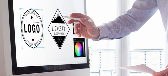
These are some of the most classic types of logos, which are mostly an icon or symbol with text inside. The emblem logo consists of the name of the brand followed by an icon, these may appear as a badge or a seal. Emblems follow a very traditional appearance, they are not the most graphically advanced logos, all they have is a symbol with a text inside or surrounding in a circular design. These logos are mostly used by institutions such as schools, universities, sports associations/teams, government agencies, also by private companies. Some famous examples of emblem logos are Harley Davidson, Starbucks, Harvard University, Manchester United, etc. All of these logos are in the form of a badge, crest, or seal and have a very classic appearance with a complex handmade design that blends well with the name of the company/institution.
Abstract Logos
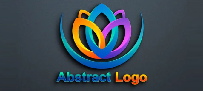
These logos consist of graphically designed pictures, which are visually attractive and represent a brand. These logos are created using a combination of different colors or just a single color used in a design that is meaningful and represents the brand. These logos are not always a pictorial form of a real-life object but an abstract or a design created purely out of visualization. Some famous examples of abstract logos are the Pepsi logo, the Nike logo, the Adidas logo, the Spotify logo, the Soundcloud logo, the Airbnb logo, etc. All of these logos are designed by imagination but are meaningful and also easily recognizable as these companies have earned a good reputation in their respective industries.
Mascot Logos
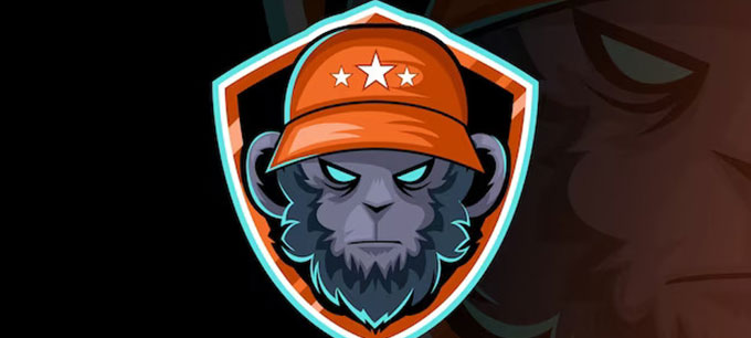
These logos are broadly used by brands, that produce edibles or packed beverages. Mascots are graphically designed cartoons of a human or an animal. These are also widely used by companies that sell products mostly for children. These logos may or may not consist of the brand names, but they are recognizable by the logo of the cartoon, These logos are usually colorful and consist of multiple colors, which are easy to design and have simple graphics. Many mascot logos are still designed by hand. Some famous examples of mascot logos are from brands such as Pringles, Wendy’s, KFC (Kentucky Fried Chicken), Reddit, Mr. Muscle, etc. All of these logos have the face of a human cartoon, which may also be the face of the brand or its founder.
Combination Logos
As the word combination suggests, these logos compromise a wordmark or a letter mark with a graphically designed symbol which can be a pictorial mark, mascot, or abstract mark. These logos are preferred by most brands especially startups, as they are easy to communicate. The picture and text can both be blended together or side-by-side depending on which looks better. Some famous examples of combination logos are, Doritos, Burger King, Toyota, Taco Bell, Domino’s Pizza, Puma etc. All these logos are a fusion of graphically designed symbols with a mix of single or two colors, with text either inside them or below, or beside them.
These are some of the most common types of logos, all of these logos are easy to comprehend with the help of their visuals. As well as their color shades and schemes. Some logos might appear as a blend of two different types, as creativity has no boundaries, so is the creativity put in to design a beautiful logo. Although it is important to create a logo that represents the name of your brand and its values as well as its product(in some cases). The right logo for a brand depends on its respective industry and the impact it wants to create in the minds of the customers. The right choice of colors and a great design highly impact the minds, so it is paramount to create a logo considering what looks best. Designing the wrong logotype for your business might not create a great impact as well as might not go well with your brand name/theme or products.